Diagnosing and Correcting a Failed Enterprise Home Experience
Role: Senior Product Designer - UX direction, research synthesis, information architecture, stakeholder alignment, usability validation
Team: Product designer, Product director, 2 Product managers, 3 Engineering Teams
Timeline: November 2024 - January 2025
Project Summary
In October 2024, a redesign of a critical enterprise dashboard failed early usability benchmarks, blocking release and putting approval, reporting, and spend oversight workflows at risk. Restarting the project wasn’t viable. I took ownership of UX direction to diagnose the failure, reset the experience, and validate a simplified solution—restoring confidence and enabling the dashboard to launch in March 2025.
Why it mattered
This dashboard governed high-risk approval and reporting workflows for enterprise administrators. Many users had spent years developing workarounds and training others to compensate for system limitations.
Shipping a redesign that disrupted these mental models—or failed to improve clarity—would not just hurt usability; it would erode trust, increase operational risk, and create resistance to future change across multiple enterprise teams.
OVERVIEW
Framing the Problem
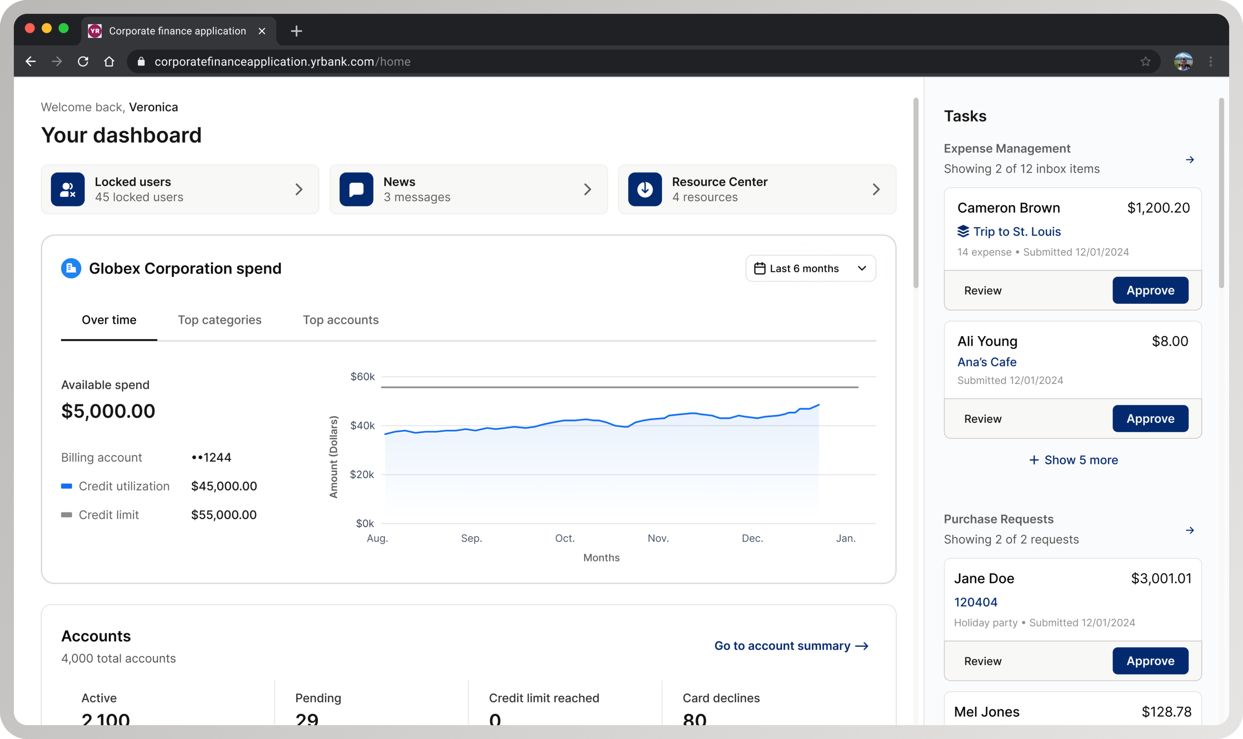
Why intervention was required: An in-production legacy dashboard (left) and an in-progress redesign that failed usability testing (right). The legacy dashboard, built over 20+ years without a coherent hierarchy, was visually modernized but retained structural and decision-flow problems—causing usability failures.
Defining Scope
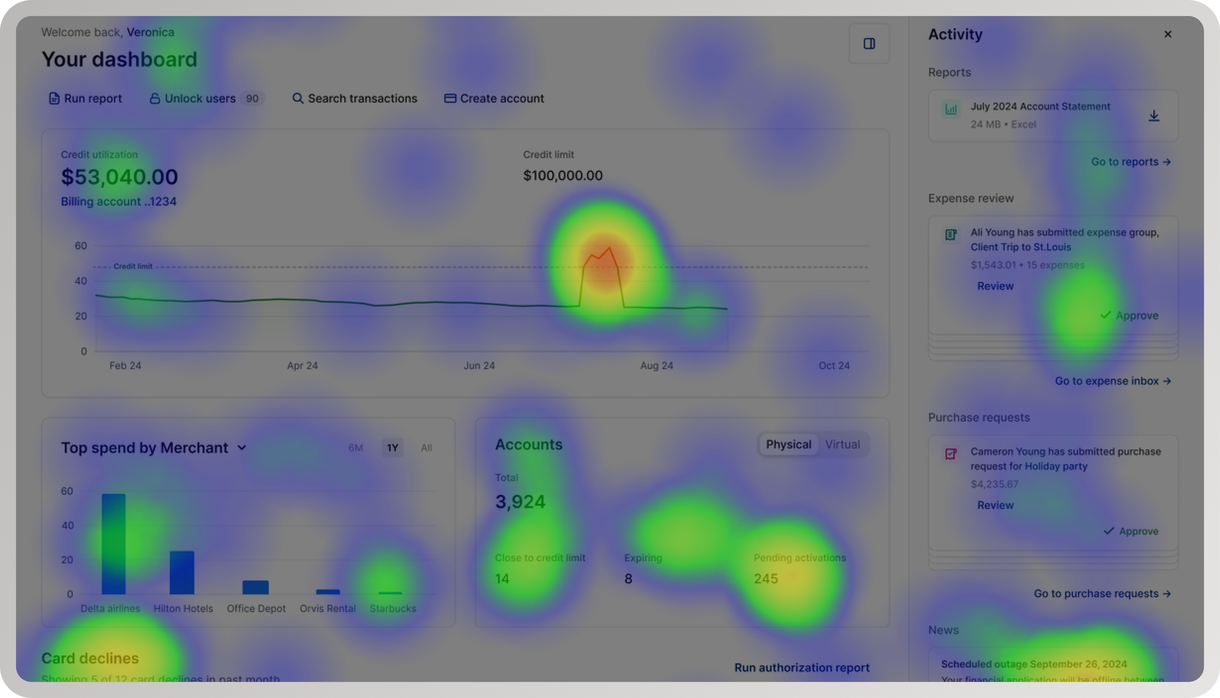
Corrective intervention: The left shows the in-progress redesign that failed usability benchmarks. The right reflects the corrected structural direction after diagnosis. Scope was intentionally constrained to structural hierarchy, task prioritization, and entry interactions—excluding net-new features or systemic redesign.
TASK
Unblocking a high-risk enterprise dashboard release
My task was to identify why the redesign was failing, correct the structural issues driving poor usability, and validate a solution that could ship without restarting or expanding scope.
Mandate: Intervene at the center of overlapping product risk, delivery constraints, and organizational pressure— without the option to restart or expand scope
APPROACH
Diagnose usability issues
Diagnostic signal: Usability pain points clustered around entry, prioritization, and task initiation—indicating a structural breakdown instead of isolated interaction issues.
I triangulated behavioral data, usability findings, and qualitative feedback to distinguish symptoms from root causes. Participants lacked clarity and confidence, but the root issue was structural: admins had no clear starting point, required actions, or guidance to navigate high-risk workflows efficiently.
Define information architecture and interaction patterns
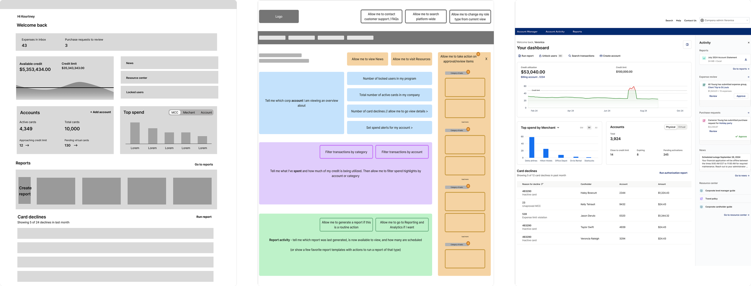
Failed redesign evolution: As the redesign moved from low- to high-fidelity, interaction patterns became more defined—but the underlying information architecture and task hierarchy remained unresolved.
After diagnosing the redesign’s issues, I rebuilt the dashboard to match what users needed. I prioritized admin goals—frequent, high‑risk tasks like approvals and reporting—while de‑emphasizing or removing low‑urgency data. Entry interactions were simplified and progressive disclosure added so deeper context appears only when needed.
Balance user needs with delivery constraints
Rather than restarting the redesign, I focused on targeted, high-leverage changes that addressed the structural causes of poor usability while preserving delivery momentum. Decisions were scoped deliberately to maximize impact on task completion and confidence without expanding scope or introducing churn.
KEY CONSTRAINTS
-
The redesign was already in progress when usability testing failed, with multiple teams building against the release. Restarting the work would have delayed dependent initiatives and increased the risk of shipping incremental fixes that failed to address systemic issues.
Design decision: The solution had to correct root usability issues without expanding scope or introducing churn across teams already committed to delivery.
-
Core components and interaction patterns were not usability-validated, requiring hierarchy and behavior to be tested as part of the solution rather than assumed stable.
Design decision: Hierarchy and interaction decisions were treated as high-priority design problems, requiring focused validation rather than broad system refactors.
-
Administrators had invested heavily in workarounds and training; previous redesigns had broken these workflows, creating resistance to disruptive change and eroding trust in the experience.
“The interface hasn’t changed much since I started using it in 2015. It’s dated and not always intuitive, but we know how to work around it. Any change affects how we support clients and respond to issues.”
— Enterprise Administrator
Design decision: Improvements needed to reduce decision burden and increase clarity without invalidating established workflows or forcing relearning.
Within these constraints, I prioritized structural clarity and continuity—improving decision flow and usability without invalidating hard-earned expertise or forcing relearning.
Partner effectively with product and engineering

Decision alignment checkpoint: Used to establish shared confidence and unblock delivery after the redesign failed usability benchmarks.
I worked with product and engineering to reframe the issue as a structural/decision-flow problem, not a visual gap. This clarified priorities, prevented churn, enabled confident execution, cut rework, and allowed validation and shipping within the original timeline.
RESULTS
Cleared usability benchmarks and approved to ship
Follow-up usability testing showed significant improvements in task clarity, confidence, and efficiency. Administrators were able to complete approval and reporting workflows more quickly, with reduced hesitation and confusion. The redesigned dashboard met usability benchmarks, reversing the earlier failure and restoring stakeholder confidence in the direction.
37% reduction in time-on-task
60% increase in approval conversion
25% increase in report downloads
82% task-fit (N=128)
100% positive/neutral first impression, 67 NPS
With usability risk addressed and validation complete, the dashboard was approved for release and launched in March 2025. The experience shipped as a stable, confidence-building entry point for enterprise administrators, supporting critical workflows with improved confidence and efficiency without expanding scope or delaying delivery.
Shipped - March 2025
REFLECTION
This work reinforced that in enterprise systems, trust is earned over time—not through novelty or visual change. When users have invested years developing workarounds and training others, design impact comes from reducing decision burden and preserving continuity. By prioritizing structural clarity over surface change, I was able to correct a failing redesign, protect delivery, and create a foundation for future change without resistance.
Earning trust over time
thanks for reading (っᵔ◡ᵔ)っ