Redesigning an Enterprise Home Dashboard
Overview
The home dashboard was the primary entry point to an enterprise expense management platform used by corporate administrators managing high-risk, high-frequency workflows. It was intended to orient users and help them initiate critical actions—but in practice, it was under-used and difficult to navigate.
A redesign was already underway when early usability testing failed to meet benchmarks, blocking the work from shipping. The team needed to understand why the design was failing and make targeted improvements without restarting the project.
I took ownership of UX direction to diagnose the failure, reset hierarchy and interaction patterns, and validate a simplified experience that could ship with confidence.
Impact
The redesigned dashboard met usability benchmarks and was approved for production release.
37% reduction in time-on-task reducing common dashboard interactions from minutes to seconds
60% increase in conversion from landing page to approved expense
25% increase in conversion from landing page to downloaded report
82% task-fit (N=128) in diagnostic testing
100% positive or neutral first impression, 100% CSAT, 67 NPS (N=12) in usability testing
My Role
I owned UX direction for the dashboard redesign.
Led UX decision-making around hierarchy, interaction patterns, and task prioritization
Planned and conducted diagnostic and usability research to identify structural failures
Partnered closely with design and product to reshape layout and flow under delivery constraints
Used research as input to guide decisions and validate outcomes
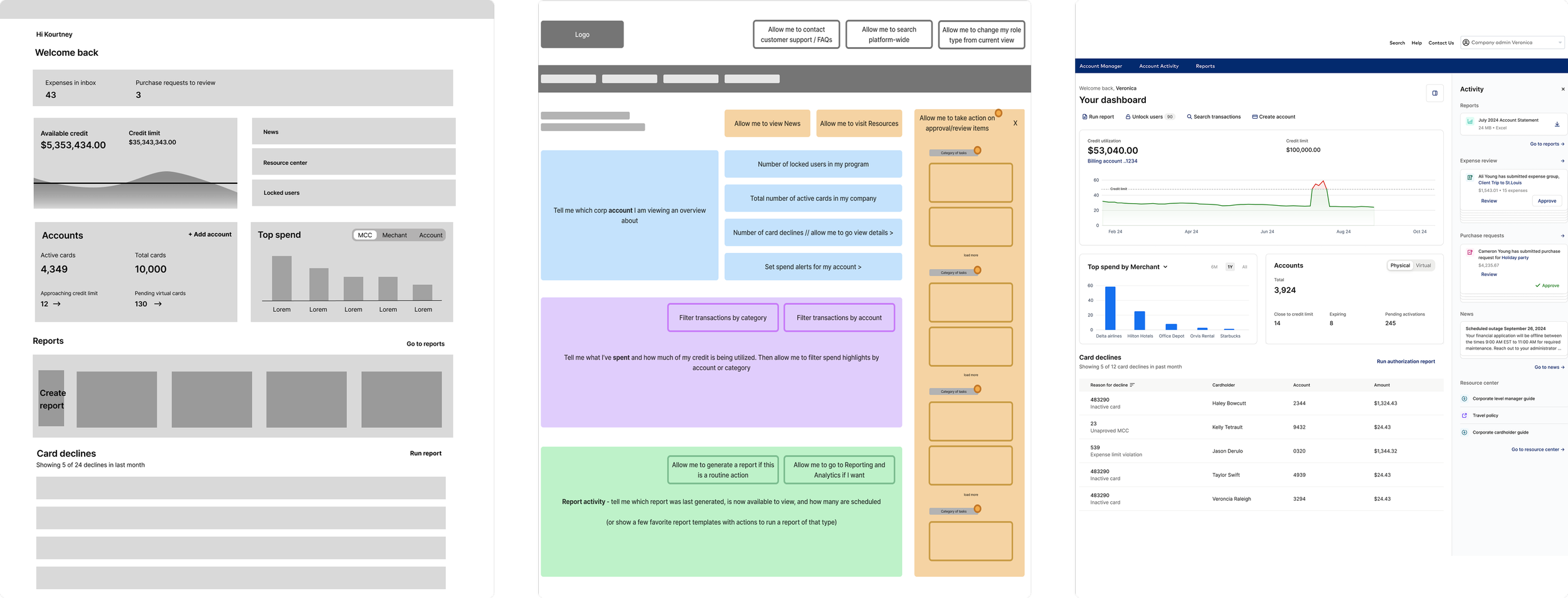
A series of wireframes, from low-fidelity grayscale (leftmost) to high-fidelity prototype (rightmost), demonstrating the evolution of the enterprise home dashboard redesign.
Context
Despite being the main entry point, the dashboard showed weak engagement:
Only 5% of administrator journeys began on the dashboard
0.71% converted to an approved expense
0.08% resulted in report generation
At the same time, dashboard widgets significantly outperformed global navigation, driving 480.9% higher conversion to reports.
The issue was not lack of functionality. Over time, the dashboard had accumulated content without hierarchy, forcing administrators to interpret everything at once rather than helping them understand what mattered.
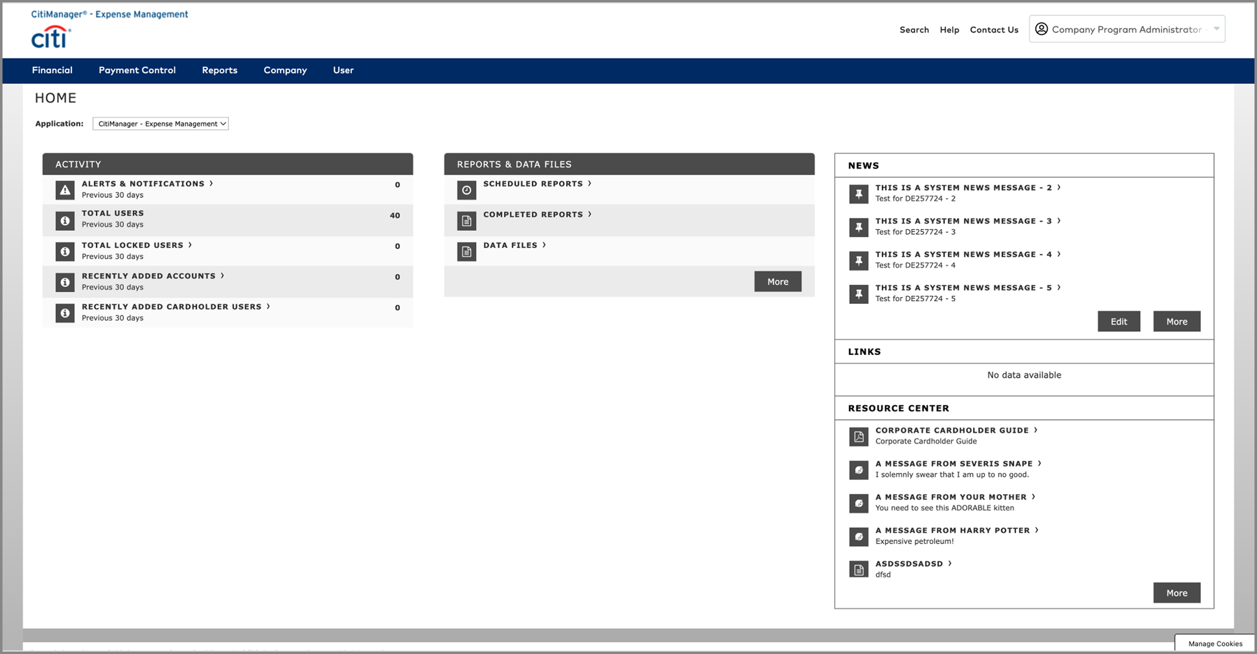
A product screenshot of the 90’s looking legacy dashboard before UX intervention
“Couldn’t find what I was looking for. Your administrator’s portal is dreadful. It’s like something designed in the 90s.”
— A very dissatisfied corporate program administrator's response to a survey
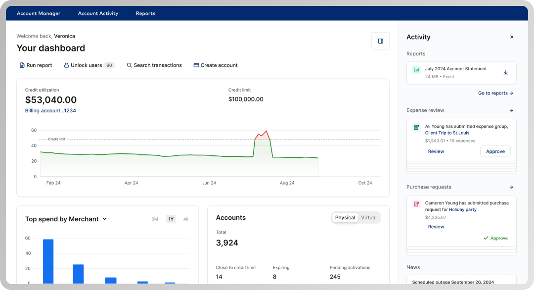
First redesign of the home dashboard introducing personalization, an activity feed with multiple cards and interactions, quick action CTAs, and data visualization
Problem
Initial usability testing confirmed the redesigned dashboard did not meet benchmarks—but it did not clearly explain why. Without a diagnosis and intervention, the team could not move forward.
The challenge was to:
Take ownership of UX direction for a failing redesign
Identify structural issues in hierarchy and interaction
Enable the design to meet usability standards and ship without restarting the work
Research & Diagnosis
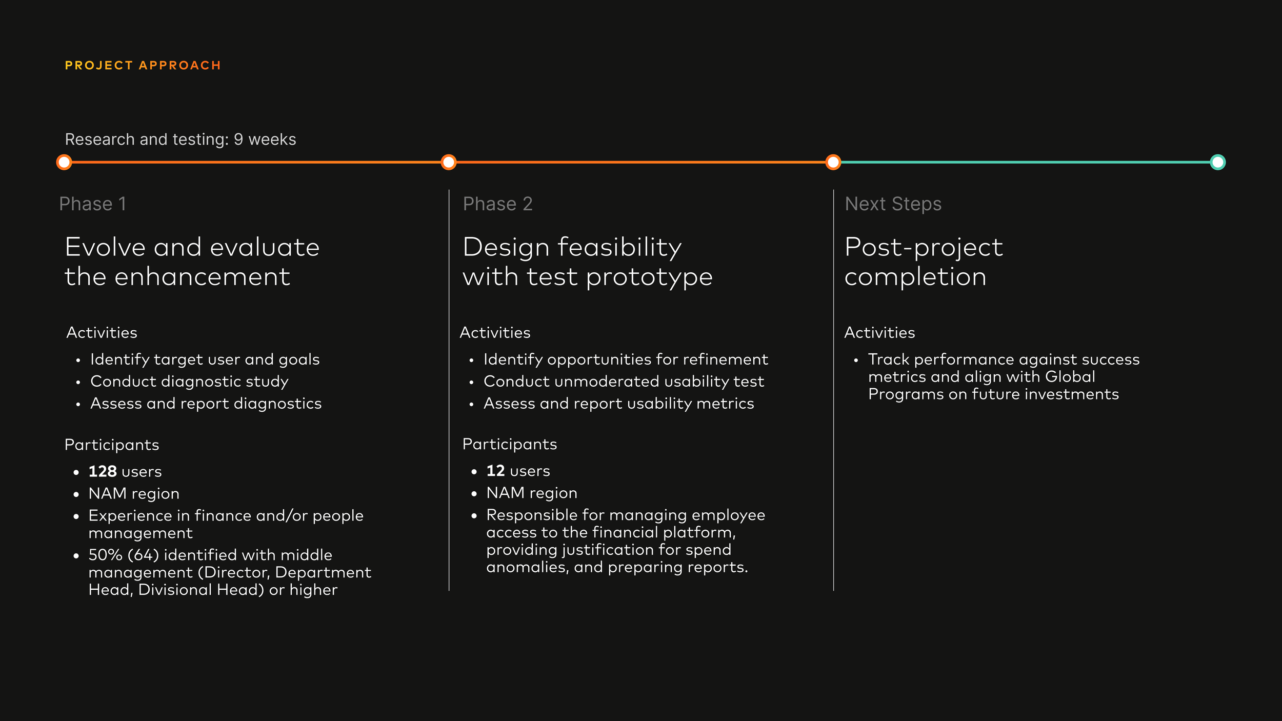
We used a two-phase research approach over nine weeks, treating research as decision support rather than validation.
Phase 1: Concept Testing
Research Methodology
128 participants reviewed a high-fidelity mockup of the redesigned corporate landing page
All participants had career experience in finance and/or people management
Top industries represented:
Construction (23), Healthcare / Medical (14), Banking / Financial Services (11), Retail (7), Transportation (7)
50% (64) identified as Middle or Senior Management (Director, Department Head, VP, Managing Director, CEO)
With Mastercard’s in-house concept testing method, I identified design opportunities and de-risked the early dashboard concept
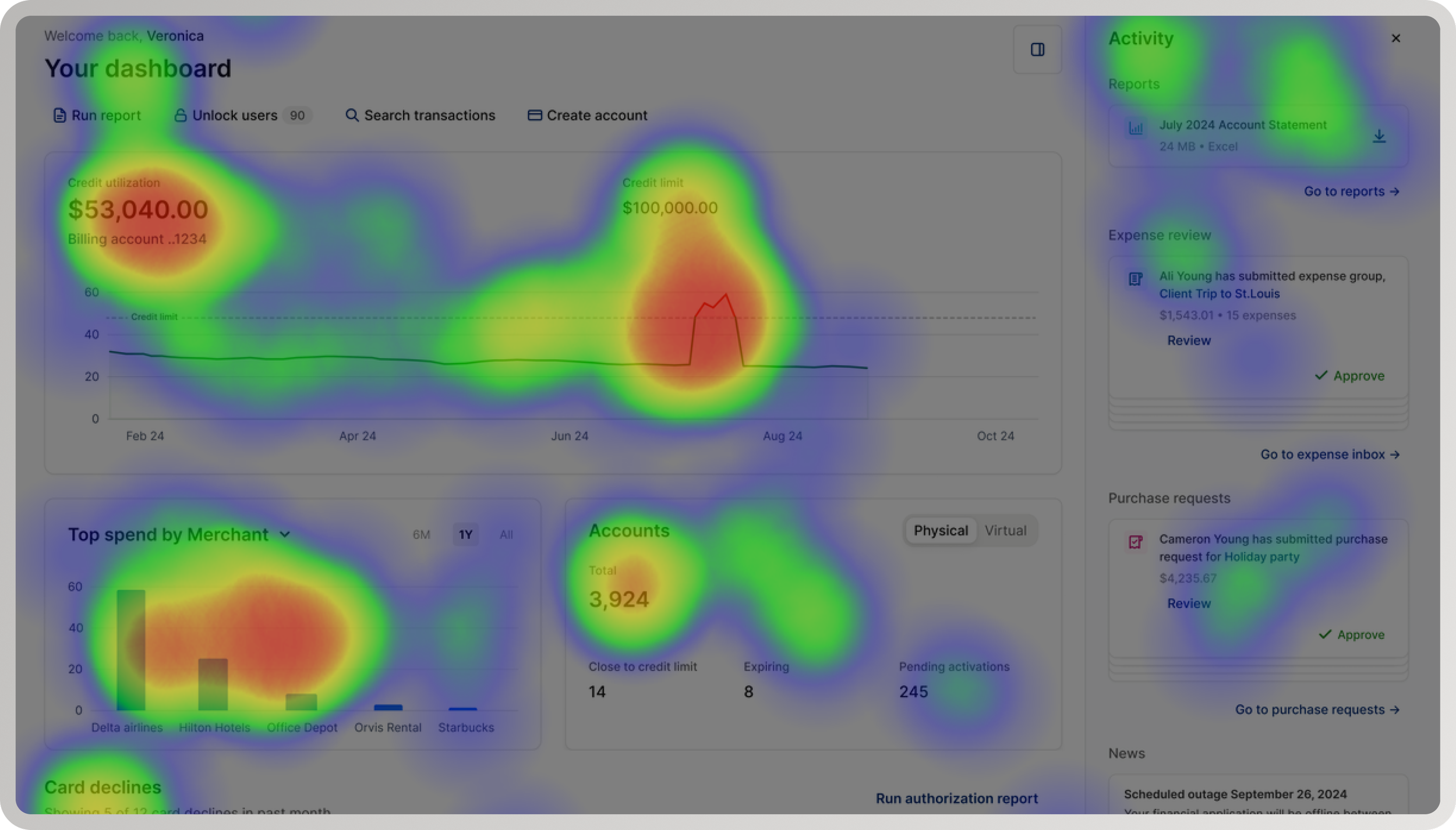
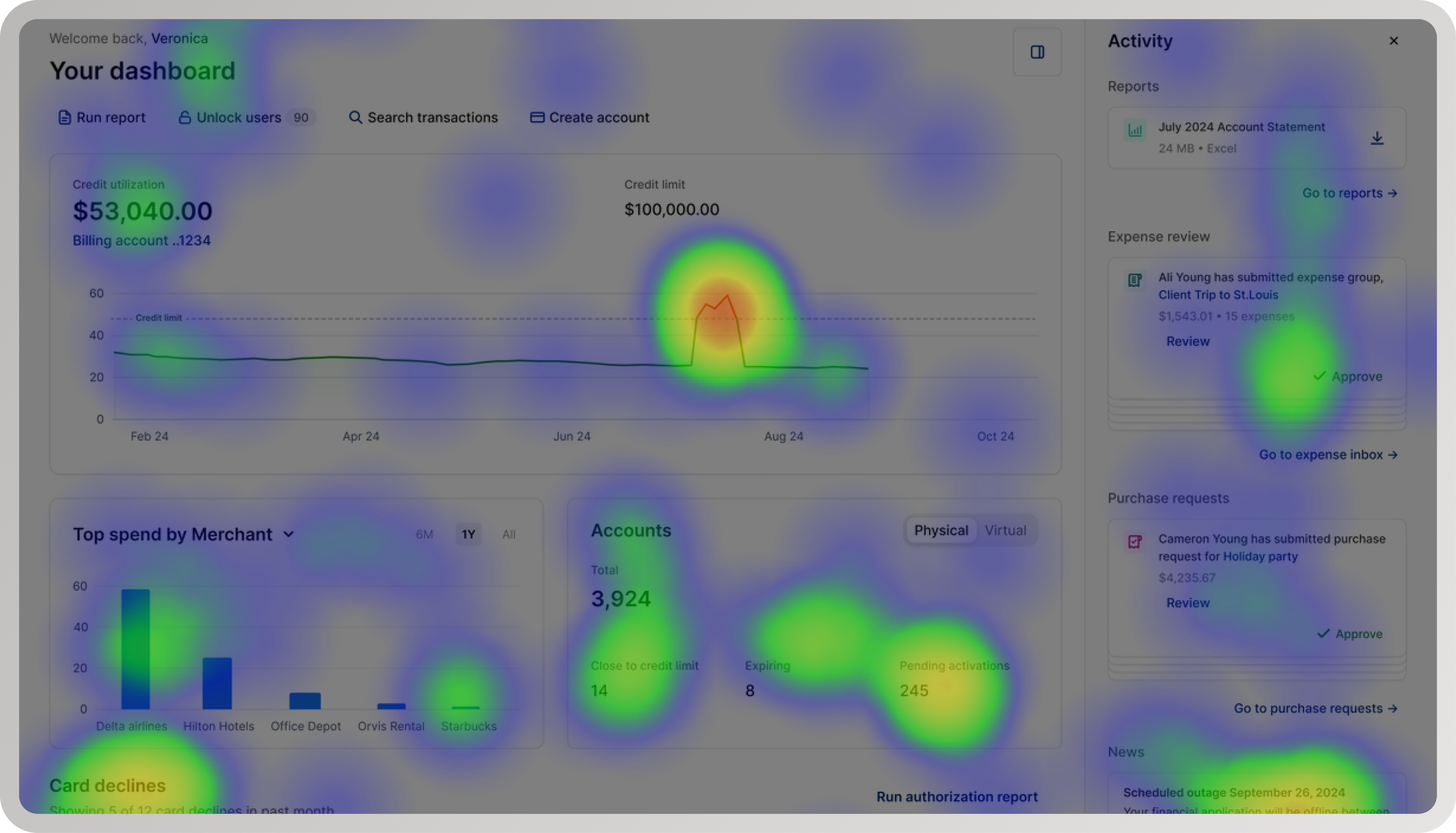
A heatmap capturing positive user sentiment towards engaging data visualizations, easily accessible information, and valuable shortcuts
Key results
82% (105) felt the redesign met their needs as financial administrators
59% (75) expected a reliable product that was easy to learn and use—and reported expectations were met
78% (100) found the experience visually appealing
Participants frequently described the experience as informative, interesting, and helpful
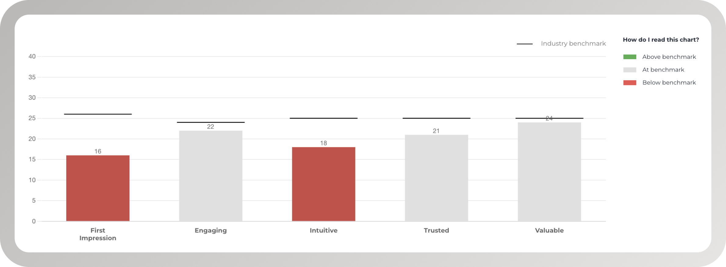
A chart demonstrating industry benchmarks for a corporate finance dashboard experience
Critical signal
Standard WEVO Diagnostic scores were at or below benchmark, particularly for first impression and intuitiveness
This clarified that the experience had value, but lacked immediate legibility and hierarchy on first load.
Key Insights
The problems were structural, not cosmetic.
Participants struggled with:
Overwhelming information density
Poor distinction between primary and secondary actions
Navigation that required prior system knowledge
The dashboard failed to establish a clear hierarchy that helped administrators understand what mattered—particularly on first load.
“Everything is kind of clustered together. It makes it very hard to read and focus.”
Design Goals
Based on research, I aligned the team around four goals:
Improve orientation on first load
Clarify primary vs secondary actions
Reduce cognitive load in a data-dense environment
Increase efficiency for frequent enterprise workflows
These goals guided all subsequent design decisions.
From Research to Design Decisions
Research showed that incremental polish would not fix the problem. The redesign required structural change.
I led UX direction changes that:
Re-established visual hierarchy to surface priority actions
Introduced a task center to support frequent workflows
Prioritized a report list and locked user management over card declines to better match administrator high-value use cases
Added visual graphs to surface spend insights more clearly
Simplified information density while preserving depth through interaction and data visualization
Reduced surfaced spend anomalies on first load to avoid constant ambient urgency
Phase 1: Early Concept
Cluttered activity feed with multiple cards and difficult to read text
Cluttered UI with too many sections, too much content
Spend anomalies everywhere - Card declines, limit exceeded, pending activations, high spend
Phase 2: Prototype
Simplified task center with up to two cards and critical content
Simplified UI with spend, account, and report sections - emphasis on general overview to encourage deep dive
Spend anomalies reduced - Not showing credit limit exceeded
Phase 2: Usability Testing
12 participants completed three tasks
Rated first impression, intuitiveness, and satisfaction
Focused on learnability, efficiency, and confidence
Shared responsibilities: managing employee access (11), justifying spend anomalies (8), preparing reports (7)
Industries: financial services (6), program management (3), purchasing (1), HR (1)
54% identified as issuers, responsible for approving cards and reporting corporate spend strategy
Research Methodology
-
Average ToT (time on task) was 44 seconds (min: 16s, max: 2min 32s)
90.9% (10) found reviewing an expense intuitive.
Too much information. Only 1 participant mentioned having difficulty with too much unnecessary information (request for customization abilities) text goes here
-
Average ToT was 36 seconds (min: 11s, max: 1min 9s)
100% (11) found downloading a report intuitive.
No difficulties mentioned
-
Average ToT was 38 seconds (min: 17s, max: 1min 41s)
100% (11) chose the correct category: Airline.
100% (11) reported that finding a program spend category was intuitive.
No difficulties mentioned.
Key Results
Follow-up usability testing showed strong performance across tasks:
100% (12) had a positive or neutral first impression, describing the experience as clean, engaging, organized, valuable, professional, and relevant
92% (11) found approving an expense intuitive
Adding a task center increased conversion from landing page to approved expense by 60%
100% (12) found downloading a report intuitive
Prioritizing a report list increased conversion to downloaded reports by 25%
100% (12) found locating a program spend category intuitive
All participants quickly identified the highest spend category (Airline), validating the use of visual graphs
100% (12) reported satisfaction with the dashboard meeting their needs
Key Insights
Participants noted that while the system felt functional and user-friendly, additional customization and features such as deeper spending analysis or fraud detection would increase long-term value.
The final redesigned prototype received a 67 NPS, forecasting strong first impression, high customer loyalty, and clear opportunities for future enhancement.
“I am always so busy and don’t have a lot of time in my schedule to try and find and dig for information. I love this interface and how it’s all in one spot.”
“This program seems to be very easy to use and very functional for purchasing needs. I can see myself using this system which also seems very robust.”
Final Outcome
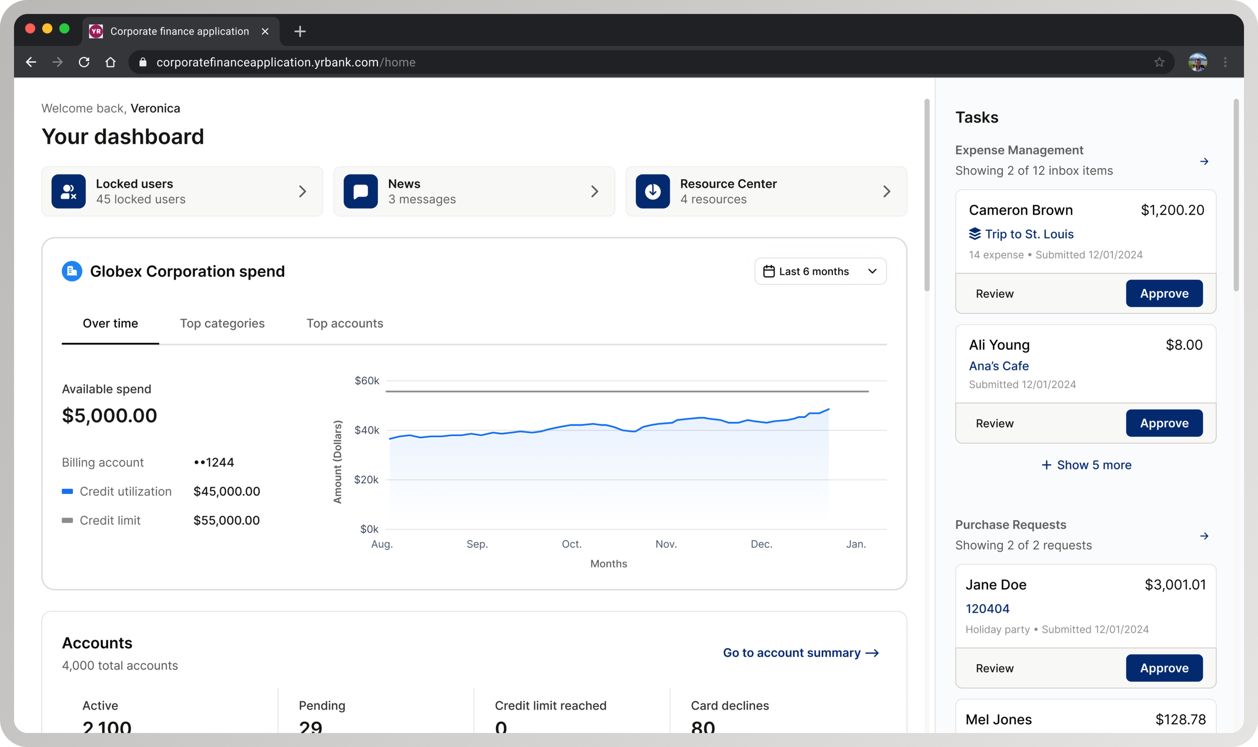
The final dashboard functions as a clear, confidence-building starting point rather than a dense data surface.
It provides:
Clear hierarchy and task prioritization
Focused entry points for approvals and reporting
High-level spend visibility with engaging visual insights
Reduced cognitive load without removing critical information
The redesign was cleared to move forward.
Next Steps
With desirability and usability validated, next steps focused on scaling impact:
Instrumenting core dashboard interactions via Mixpanel
Tracking behavioral metrics alongside sentiment
Aligning with Global Programs on future investment decisions
Evaluating customization, spending analysis, and fraud detection using desirability, feasibility, and viability
Reflection
This project reinforced that senior design work often means stepping into ambiguity, taking accountability for direction, and using research to guide decisive change under delivery pressure.
The most important outcome was not just improved usability, but restored confidence—both for administrators using the system and for the team shipping it.