Modernizing a Legacy Enterprise Platform: $2M Investment, $17M Renewal, and 100% YoY Growth
Lead Product Design and Research Strategist (Vision + Systems + IA)
Background
Smart Data is Mastercard’s enterprise SaaS platform for corporate expense management. I defined and led a 5-year design vision that modernized the platform and set the strategic foundation for growth.
Role
Key Outcomes
100% YoY growth in mobile MAU (1,000 → 4,000+)

125% increase in enterprise adoption (200 → 450 customers)

App rating improved from 2.8 → 4.2 across 100+ reviews

Secured $2M investment for the product vision

Contributed to a $17M renewal with platform improvements

Part I
Ecosystem Mapping > Research Framework > Legacy UX Review
Understanding the context
System Baseline Analysis
Mapping Constraints and Opportunities
Before defining the vision, I mapped the ecosystem to surface friction points, dependency risks, and manual-effort bottlenecks. These insights guided decisions around intelligence, automation, and integration.
Original Ecosystem
Fragmented, transactional system with limited intelligence, missing features, and high operational overhead
Evolved Ecosystem
Connected, intelligent ecosystem with guidance loops, robust functionality, and scalable automation
End-to-end Research Framework
Cross-functional, Iterative Research Program
I led the 3-phase research program, partnering with Product, Engineering, and Sales to align on user needs and business goals. The framework included continuous feedback loops to refine insights and validate assumptions throughout the process.

Legacy Desktop Experience
Inefficient, High-Friction Approval Workflows
Desktop workflows were slow, unclear, and overly manual — causing approver delays, repeated errors, and a lack of trust. These issues compounded at scale, especially for teams processing thousands of expenses per month.
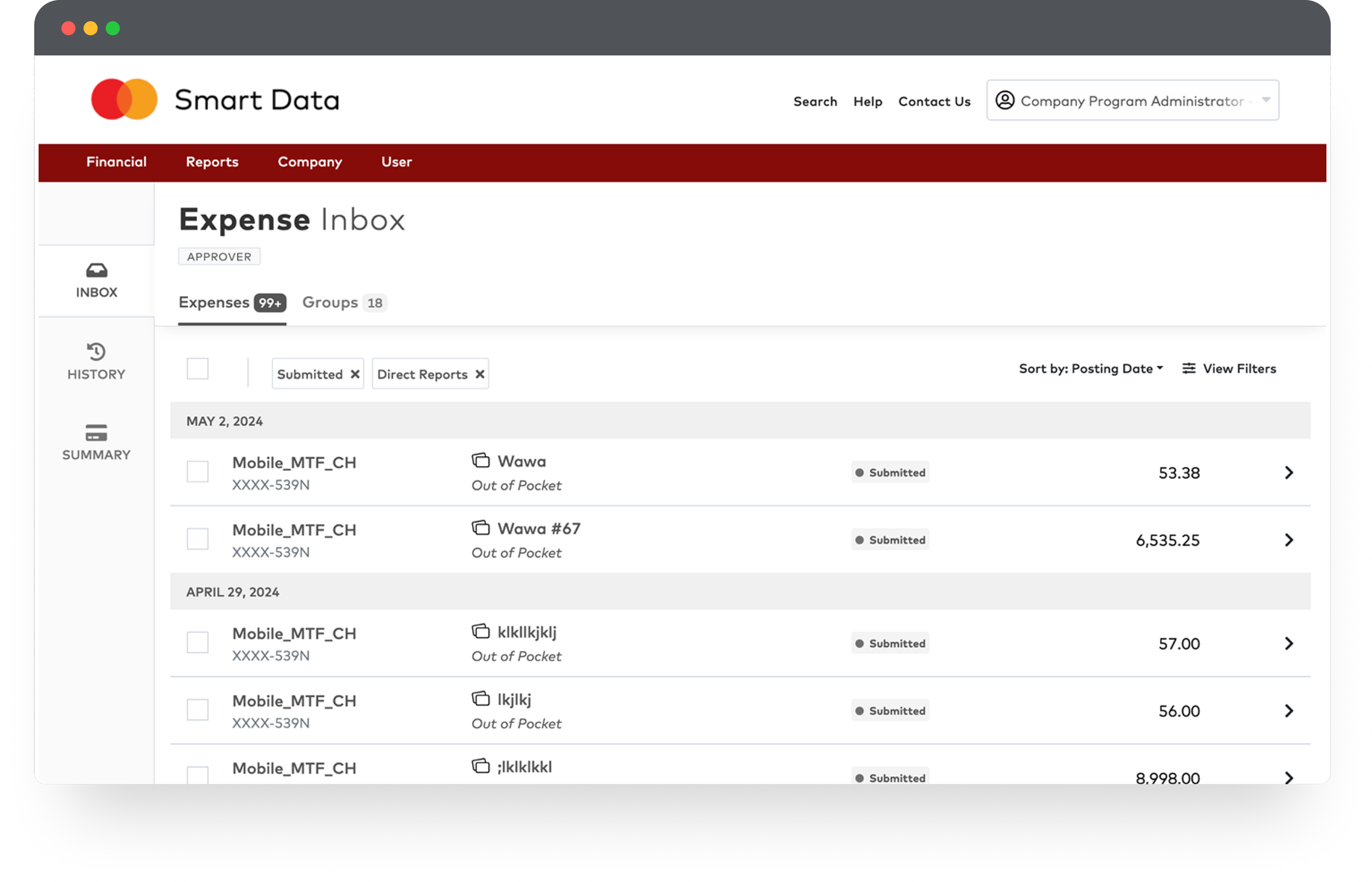
Screen 1: Expense Inbox (List View)
Hard to scan, unclear statuses, and buried filters
The inbox made it difficult to access information: filters were buried, visual hierarchy was flat, and high-volume lists were hard to scan. Approvers did not trust what they were seeing because statuses, grouping, and totals lacked clarity
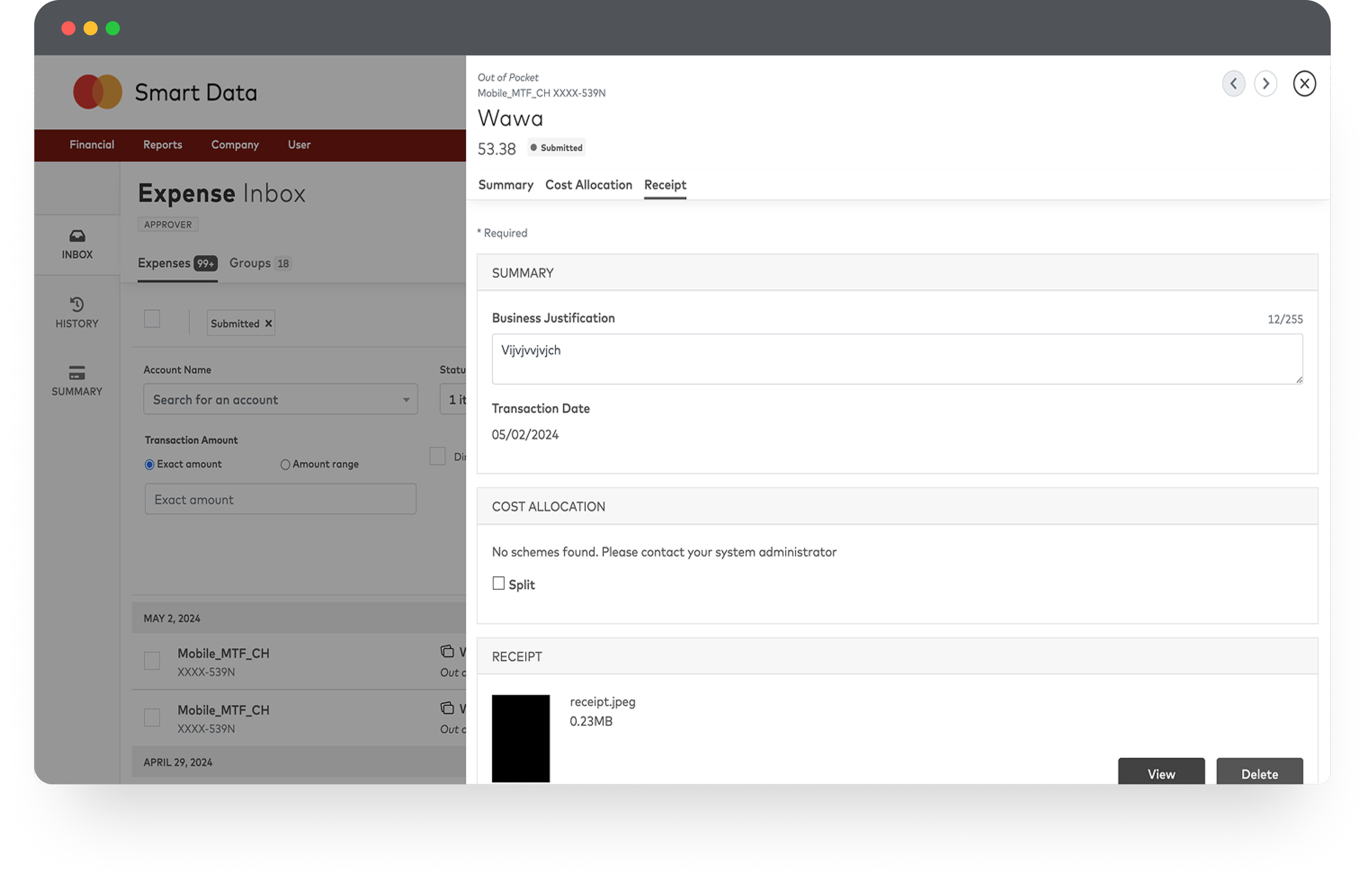
Screen 2: Expense Details (Modal View)
Context lost, workflows slowed, and details scattered
The detail view relied on a large modal that blocked context and forced users through a slow, multi-step workflow. Critical information was scattered across tabs, reducing transparency and making even simple approvals inefficient
Legacy Mobile Experience
High Effort, Low Confidence Mobile Tasks
Mobile workflows lacked hierarchy, clarity, and essential functionality — slowing users down and reducing confidence in critical tasks.
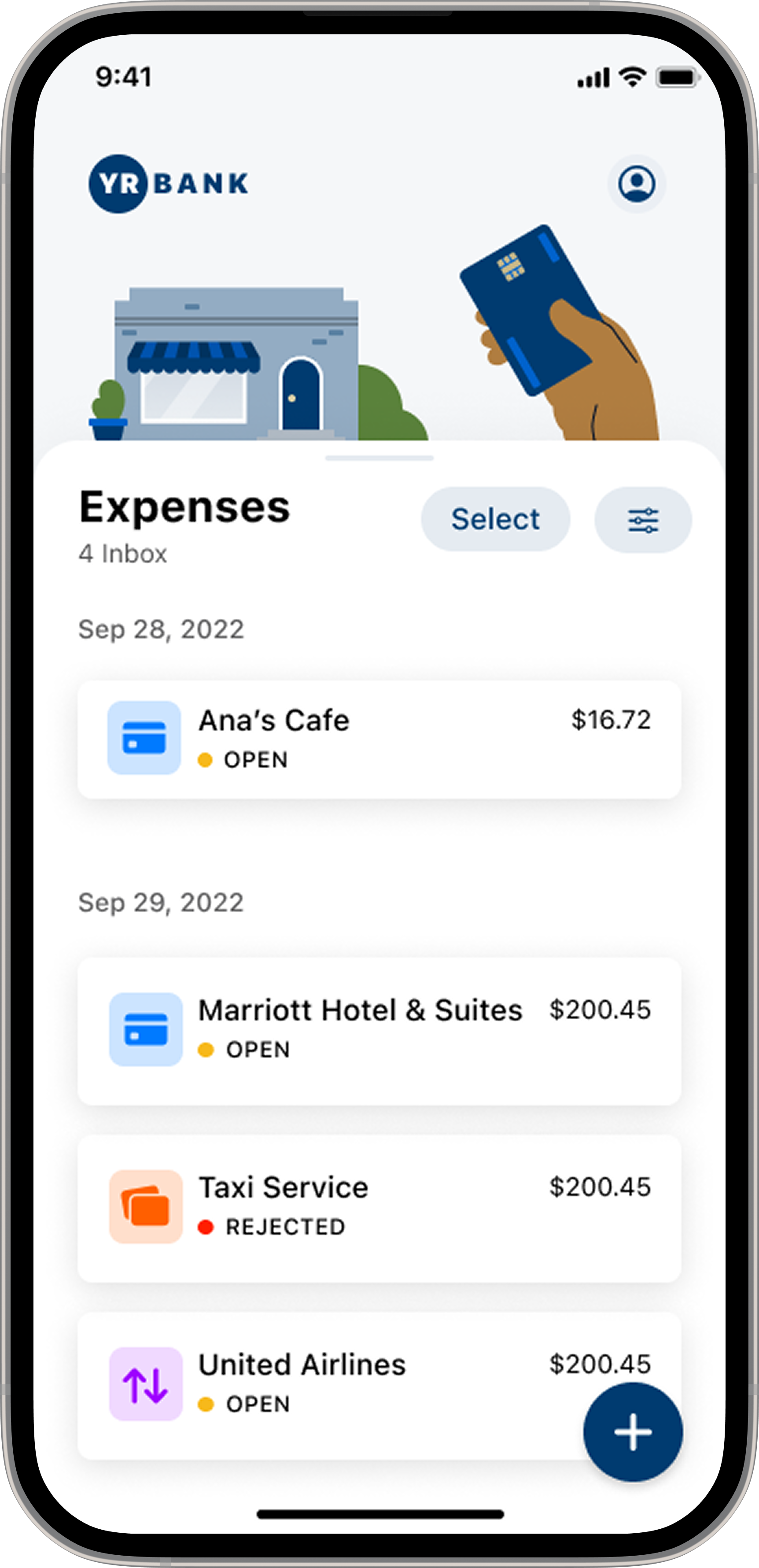
Screen 1: Mobile Inbox
Low hierarchy and unclear statuses
The app lacked essential functionality, and limited visual hierarchy made it difficult to scan statuses or spot priorities — hindering quick decisions
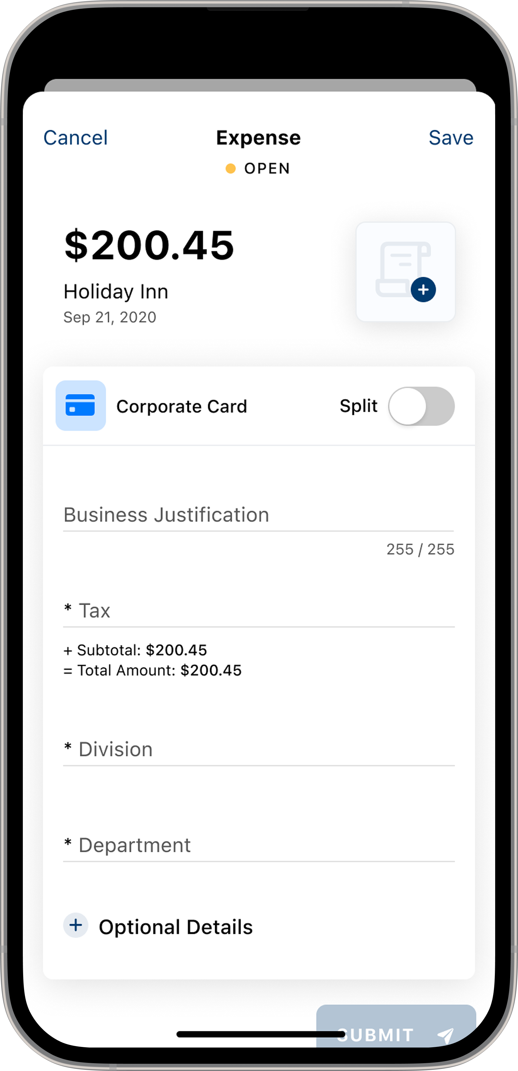
Screen 2: Mobile Details
Form-heavy layout with unclear critical details
The long, manual, form-heavy layout slowed users down. Critical details weren’t clear, reducing confidence in completing even basic tasks
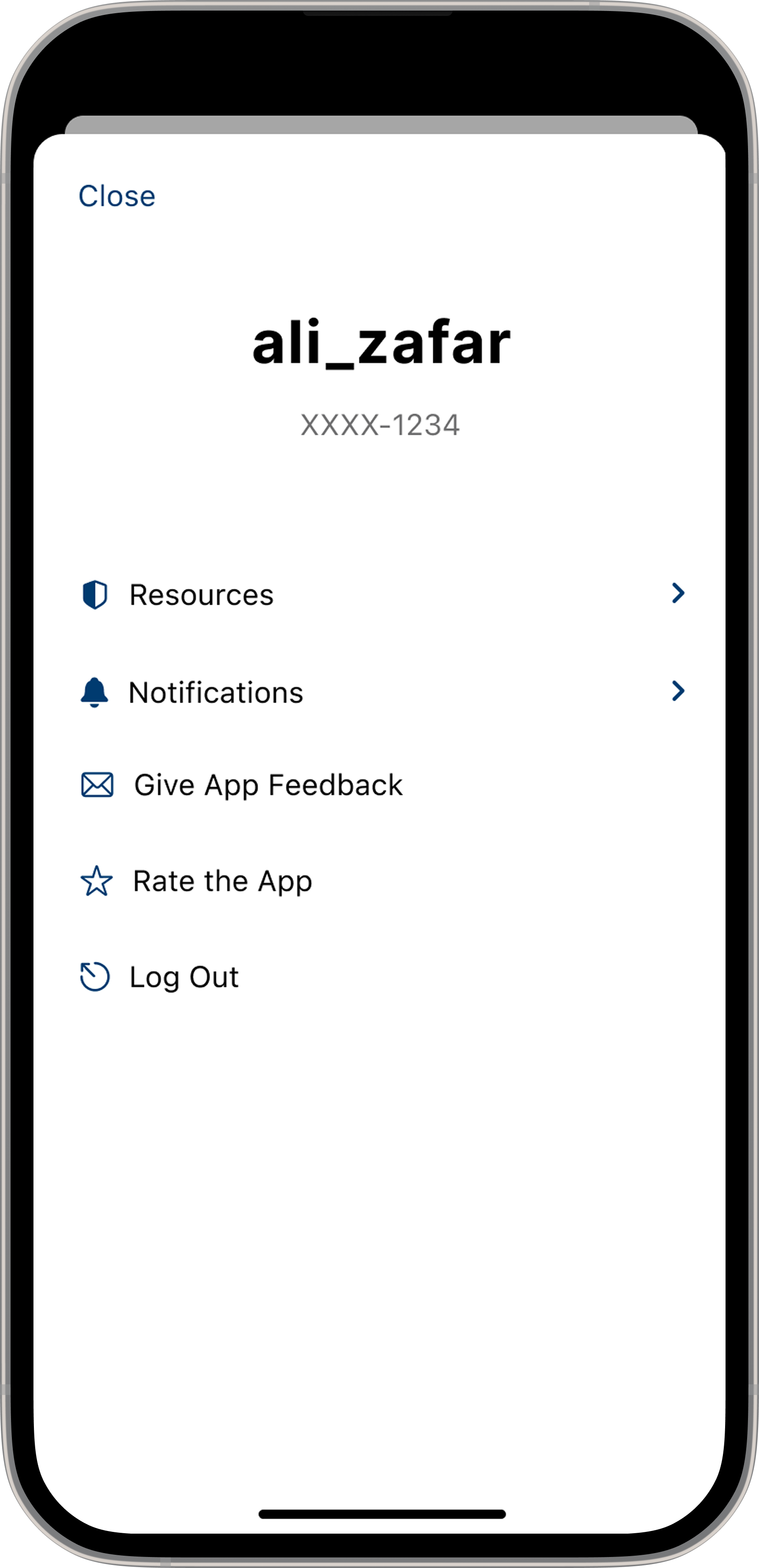
Screen 3: Mobile Profile
Disconnected structure with no guidance
The sparse, utilitarian layout offered little guidance, and essential account actions were missing or disconnected — making navigation difficult
Part 2
Key Insights > Journey Map > Service Blueprint > Design Principles > Roadmap
Defining the scope
Key Insights
Cardholder and administrator research surfaced four core themes:
Outdated authentication and onboarding created friction and increased dependency on administrators
Batch processing delays removed real-time transparency and led to lost receipts and reactive workflows
Fragmented tools forced users into repetitive, manual steps across multiple systems
Limited data visibility slowed decision-making for both cardholders and finance teams


User Feedback Examples
Customer Voice: What This Looks Like Day-to-Day
“When the card is swiped, the charge doesn’t appear in the app for 2–4 days. Cardholders have to take a photo of the receipt and store [the receipt] until the charge appears — which defeats the purpose of digitizing the process. They also have to remember which job the charge was for and manually attach it later. Our previous provider showed charges instantly and let us submit everything on the spot.”
— Issuer Quote
This quote reflects a consistent pattern from users: manual, delayed, and repetitive workflows caused by outdated system architecture
Cardholder Journey Mapping
Transforming a Manual System into a Real-Time, Cardholder-First Experience
Before
Cardholders relied on delayed posting, manual entry, and outdated authentication that created friction, lost receipts, and reactive workflows
After
The redesign introduced real-time transparency, simplified submission, and secure modern access — shifting the experience from manual and delayed to proactive and automated
Journey Gaps & Improvements at a Glance
This summary highlights the core journey gaps identified during research and the improvements delivered through the redesign.
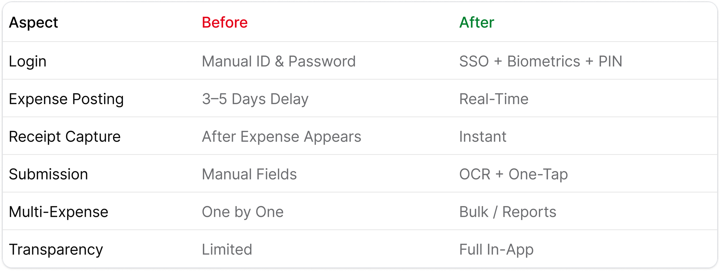
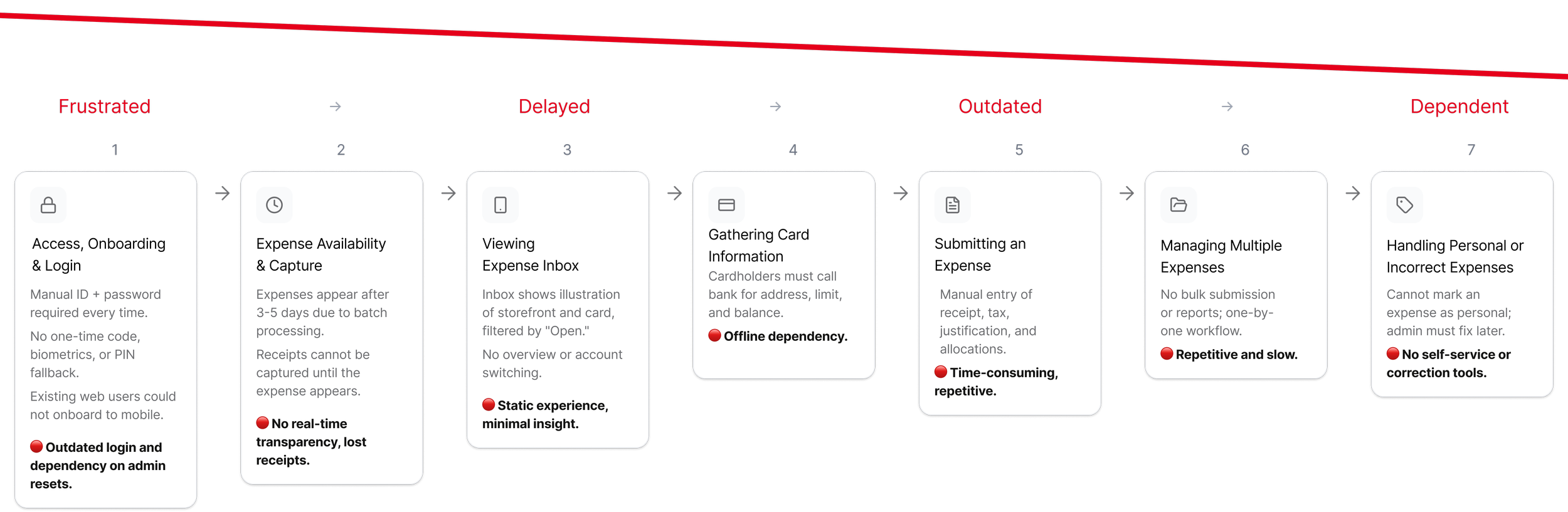
Before Redesign - Current State
This journey map illustrates the seven major friction points cardholders experience before the redesign.
After Redesign - Future State
This future journey demonstrates how real-time infrastructure and modern authentication unlock a proactive, automated expense experience.

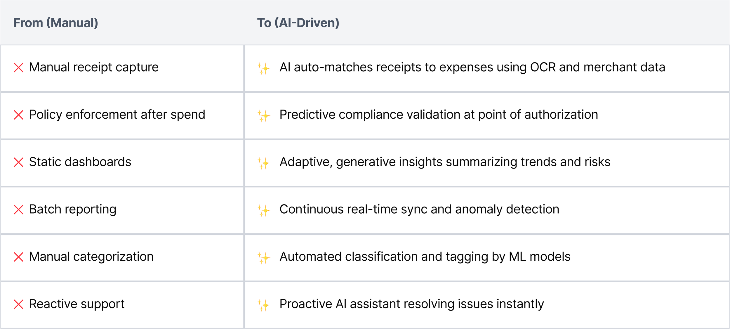
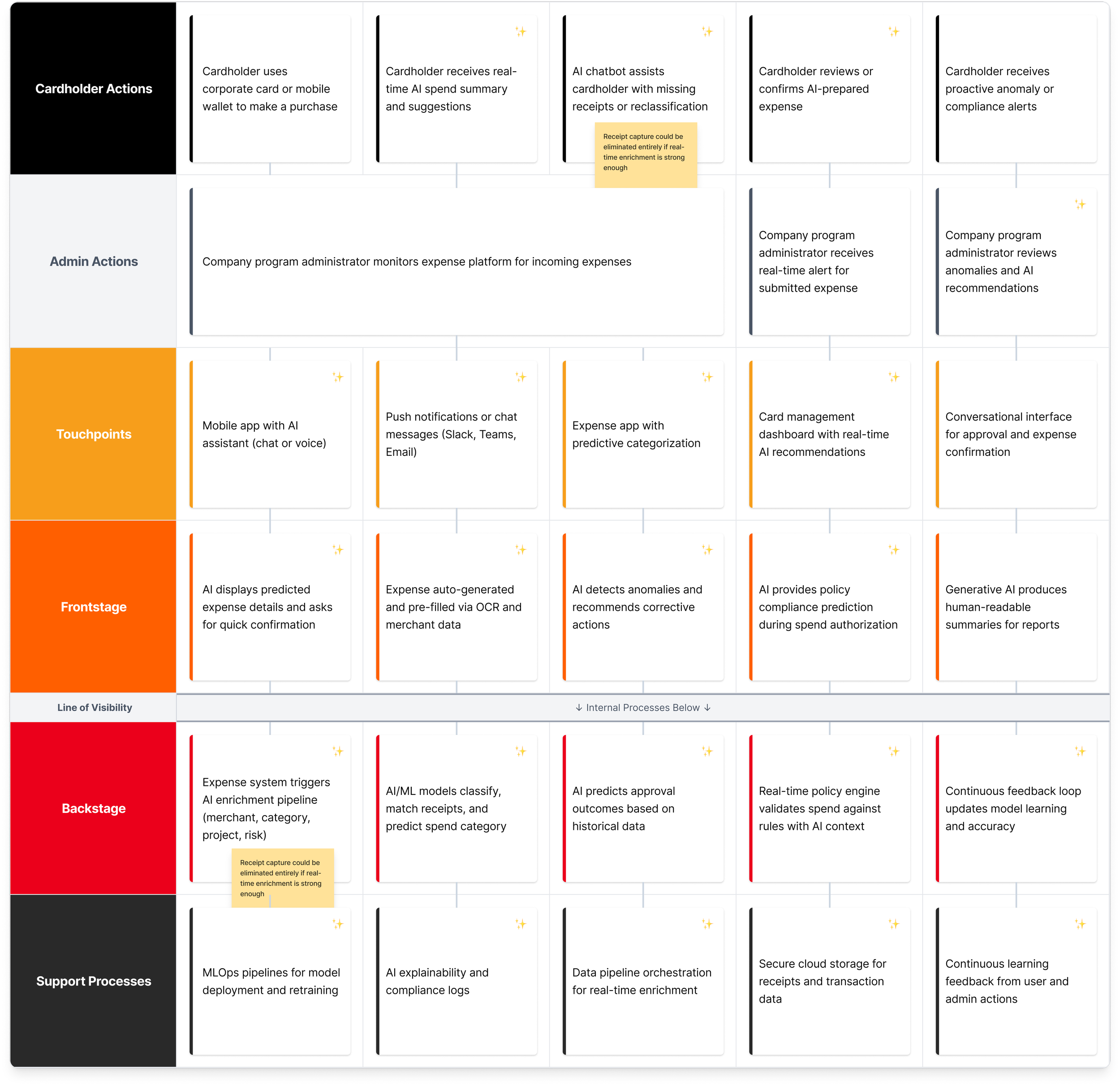
Corporate Finance Service Blueprint: AI-First Real-Time Expensing
An updated AI-driven service blueprint for corporate expense management, illustrating automation, prediction, and conversational support across the full spend lifecycle.
Research-Informed Design Principles
These design principles emerged from cross-functional user research with cardholders, finance administrators, and compliance teams, and guided the creation of a unified, real-time expense management experience.


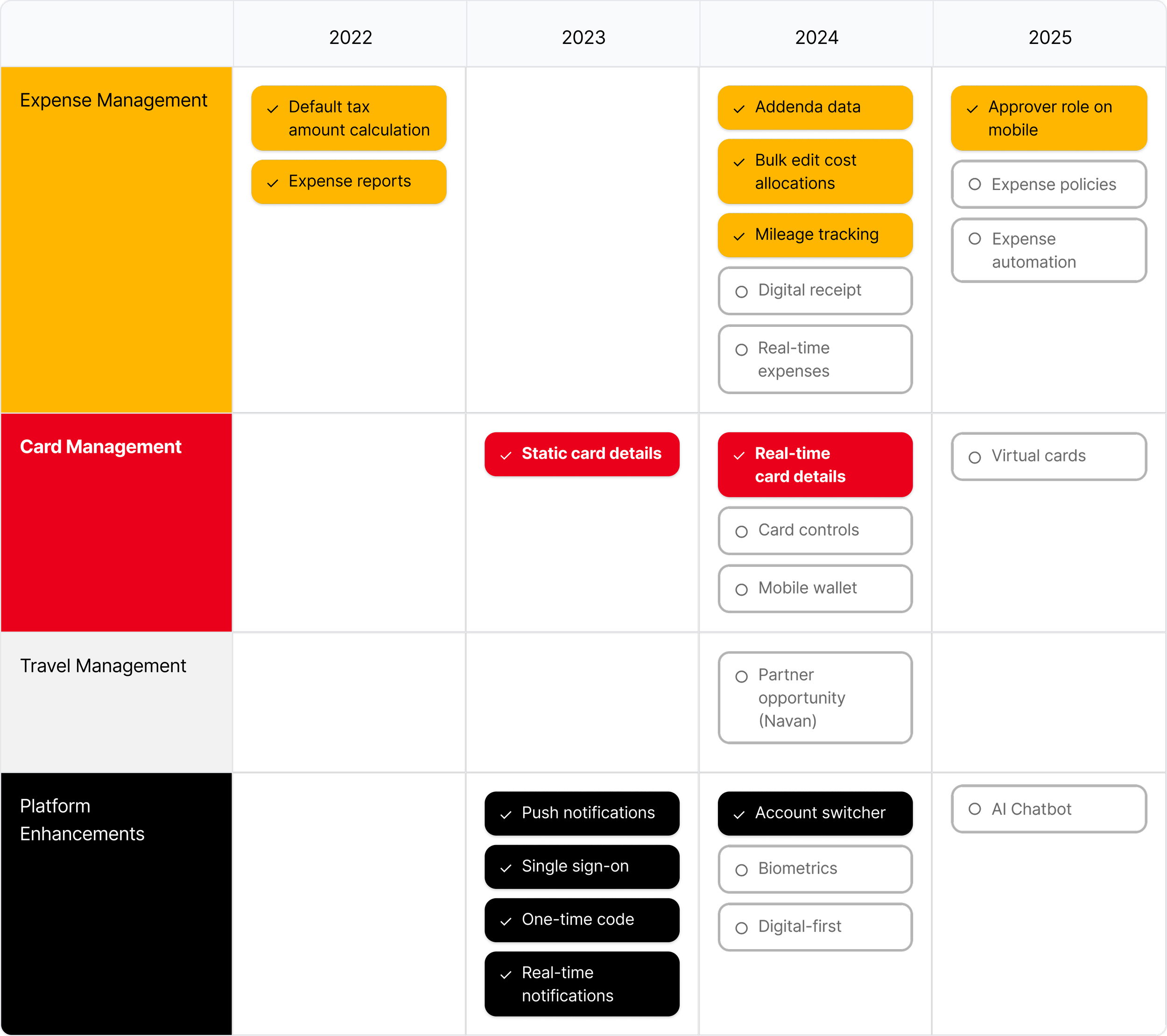
Product Design Roadmap 2022-2025
A product design roadmap showing initiatives that were completed (✓) and deferred (○) due to time, technical feasibility, internal product overlap/ownership negotiations, and technical debt. This roadmap informed quarterly planning, reduced design/engineering misalignment, and set expectations for long-term platform modernization.
Part 3
Seamless access > Real-time transparency > Simplified management
Solutions and highlights
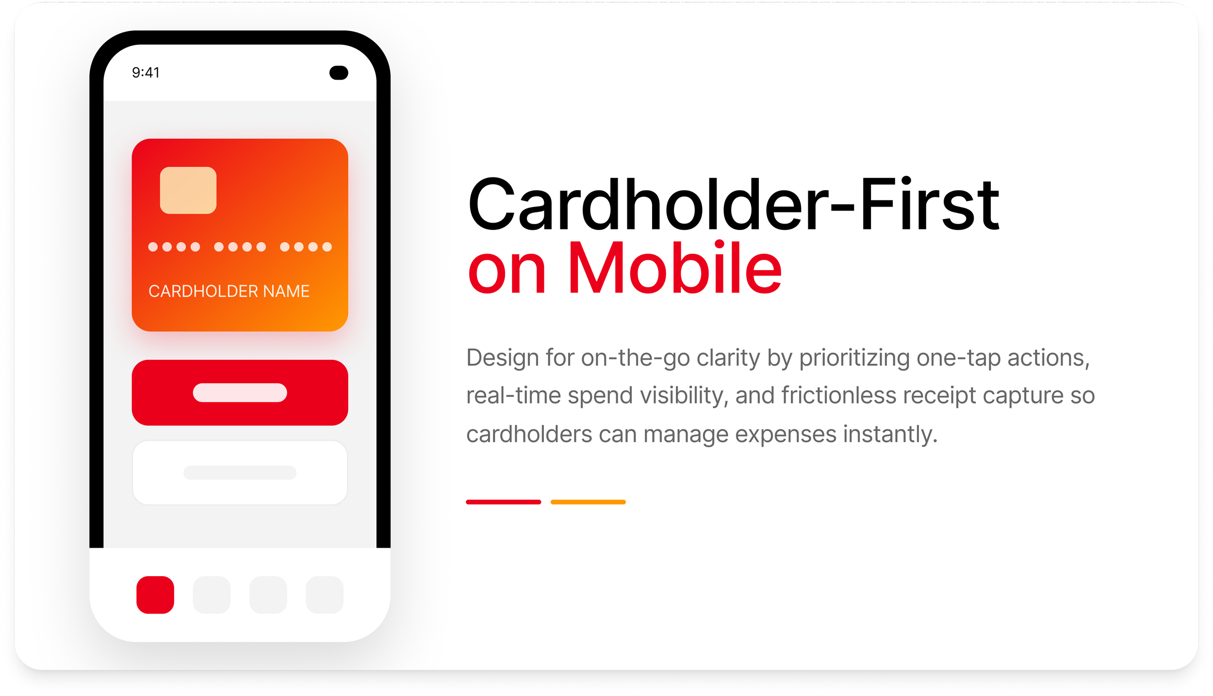
Providing seamless access
I designed a modern authentication flow using company sign-on and native biometrics to eliminate password friction and streamline secure access into the expense management app.
Reduced friction: Biometric unlock replaces repetitive password entry and builds trust.
Predictable transitions: Consistent loading and fallback logic strengthen trust.
OS-native patterns: iOS authentication and permission flows ensure security and familiarity.

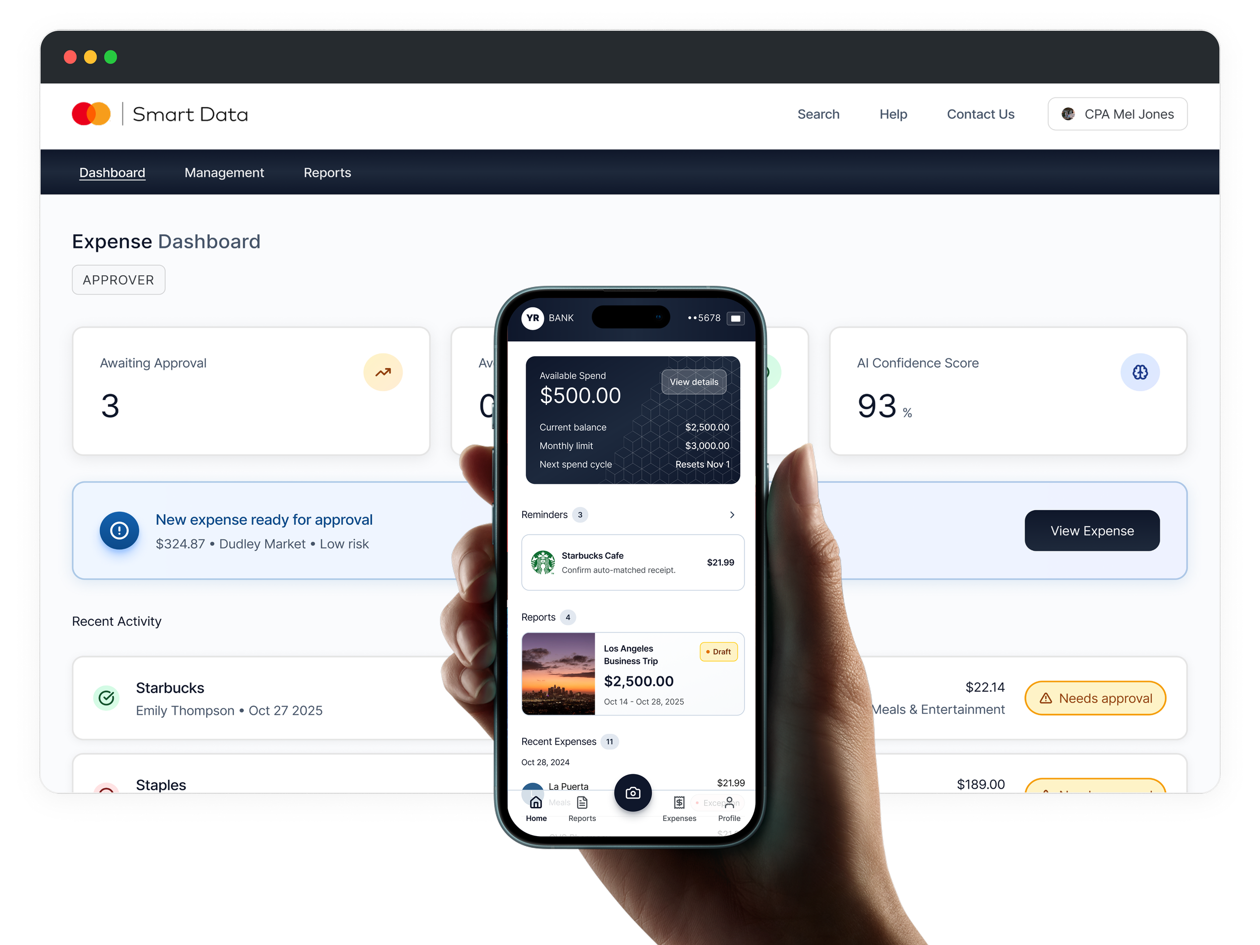
Real-time transparency
I designed an end-to-end real-time expensing experience, from biometric authentication to instant receipt capture, ML-powered extraction, and automatic expense sync, to reduce manual entry and shorten the reimbursement cycle from days to seconds.
Reduced authentication friction using pass-through biometric unlock and device pin for robust security and immediate access.
Auto-capture & ML extraction to eliminate manual entry.
Inline confirmation so the user gets clear, fast feedback.

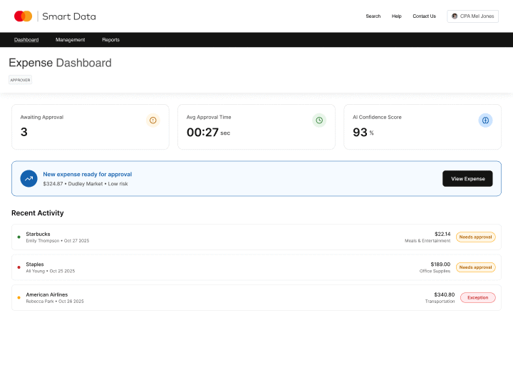
Simplified expense management
I designed a real-time expense approval flow to reduce reviewer pain points by surfacing AI-generated insights, auto-categorization, and one-tap approvals.
AI surfacing confidence indicators to reduce review time.
Inline detail drawer for rapid triage without losing table context.
One-click bulk approvals based on rules + model certainty.